by Ryan Narod for Mutiny
I talk to marketers all the time, and here’s a situation I hear far too often. Marketers spend all their time and effort driving traffic to their site through channels like ads, search, and events, but when new visitors arrive, 99% of them skim the home page and bounce.
In general, we see the #1 reason that companies aren’t able to drive top-of-funnel engagement is that their website content represents the lowest common denominator. They’re trying to talk to all of their audiences, but they end up resonating with nobody.
What we’ve observed is that companies who are able to drive top-of-funnel engagement understand distinct segments of their website traffic, personalize experiences for each visitor, and measure the impact of each personalization.
If you show each visitor the most relevant content for their industry, size, or stage of funnel, you can increase your odds of closing the deal by 3x (that’s real data from our customers).
Start by identifying your website visitors
Chances are you’ve heard about website personalization, but there’s probably a reason you haven’t done it – it used to be impossible to execute well. Data used to be hard to come by. Unless someone filled out a form, it was hard to identify anonymous website visitors.
Today, there’s an entire data ecosystem that makes it easy to know who is visiting your website as well as useful data about them (industry, company size, etc.) that you can use to personalize with ease. Here are a few popular data sources that we see our customers using:
- IP enrichment: There are amazing data sources like 6sense and Clearbit that take an anonymous website visitor and tells you the company they work for as well as hundreds of company-level attributes.
- First-party data: CRM data from platforms like Salesforce, Hubspot, and Marketo, as well as product usage data from Segment.
- UTM data: You can also use UTMs to identify visitors coming from paid ad platforms like Google Adwords, Facebook, and LinkedIn.
Build personalized experiences that drive engagement and conversions
Now that you know who’s visiting your website, you’ll put that data to work and build personalized experiences, whether it’s changing page content, adding a modal, sidepop, or banner. Here are the 3 “quick wins” that take minimal effort and typically have the highest impact.
1. Personalize by company size
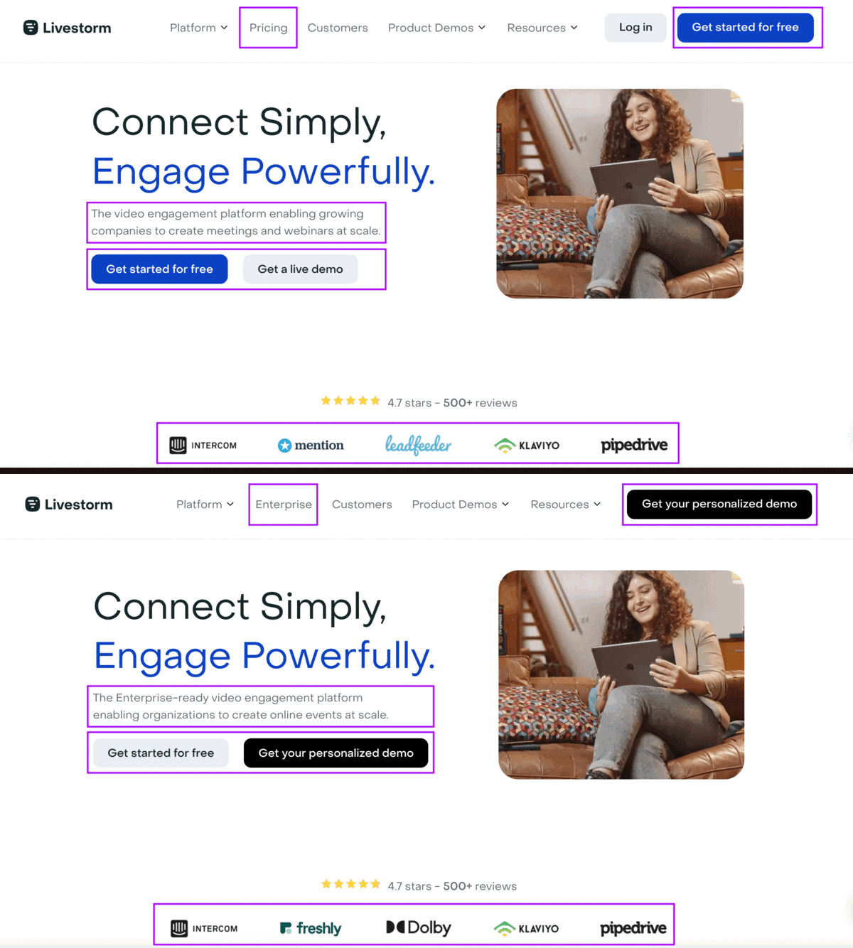
You wouldn’t pitch your product to a large established organization, with its numerous resources and decision makers, the same way you would pitch it to a startup. Neither should your website. So craft a homepage that speaks to each of these audiences individually. If an enterprise visitor comes to your site, you may want to switch out the logos to show large companies and change the CTA from “start free trial” to “get a demo.”
That’s exactly what Livestorm did when it launched a personalized experience for enterprise visitors.
“We don’t push the pricing pages, and we redirect people to pages that highlight the main benefits of an enterprise subscription,” Thibaut Davoult, head of growth at Livestorm says. “We are used by startups, by governments, by pharmaceutical companies, by media companies, and consulting firms, so we really need to adapt the message. The right moment [to do that] is when visitors are on our website. We need to push the right message at the right time because if they leave, it’s too late.”
The results of this experiment? 205% more enterprise leads and larger deals.
2. Personalize by industry
Odds are your product is used by people in a variety of industries, so when they arrive on your site, don’t leave them wondering if you fit their unique needs. Show them that you do at first glance with a customized headline, imagery, social proof, and more.
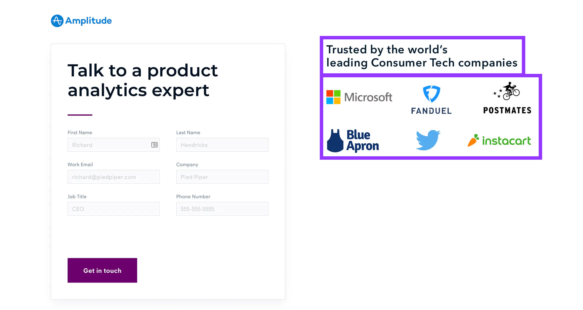
Amplitude serves different industries, so the product-analytics company personalized its website for both B2B and consumer-tech companies, as illustrated below.
Personalization on a demo page for consumer tech companies
Personalization on a demo page for B2B companies
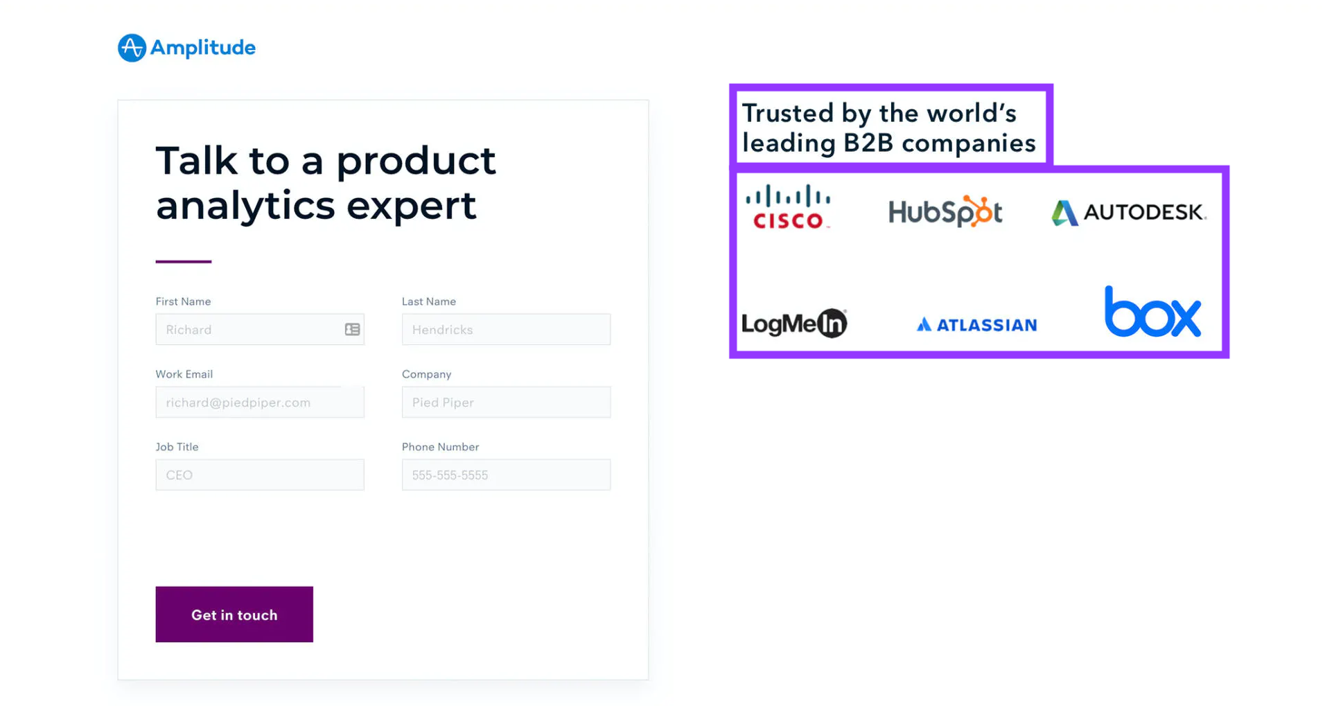
When potential customers saw that Amplitude could solve their problems specifically, they converted. There was a 54% increase in conversions, to be exact.
3. Give ‘em what they want: Personalize by search terms
Bidding on competitor keywords? Create a landing page that details why your product is better. Bidding on price-based search terms? Personalize a page that answers common pricing questions and makes a convincing ROI case.
For example, when someone searches for “startup credit card,” Brex displays the page below.
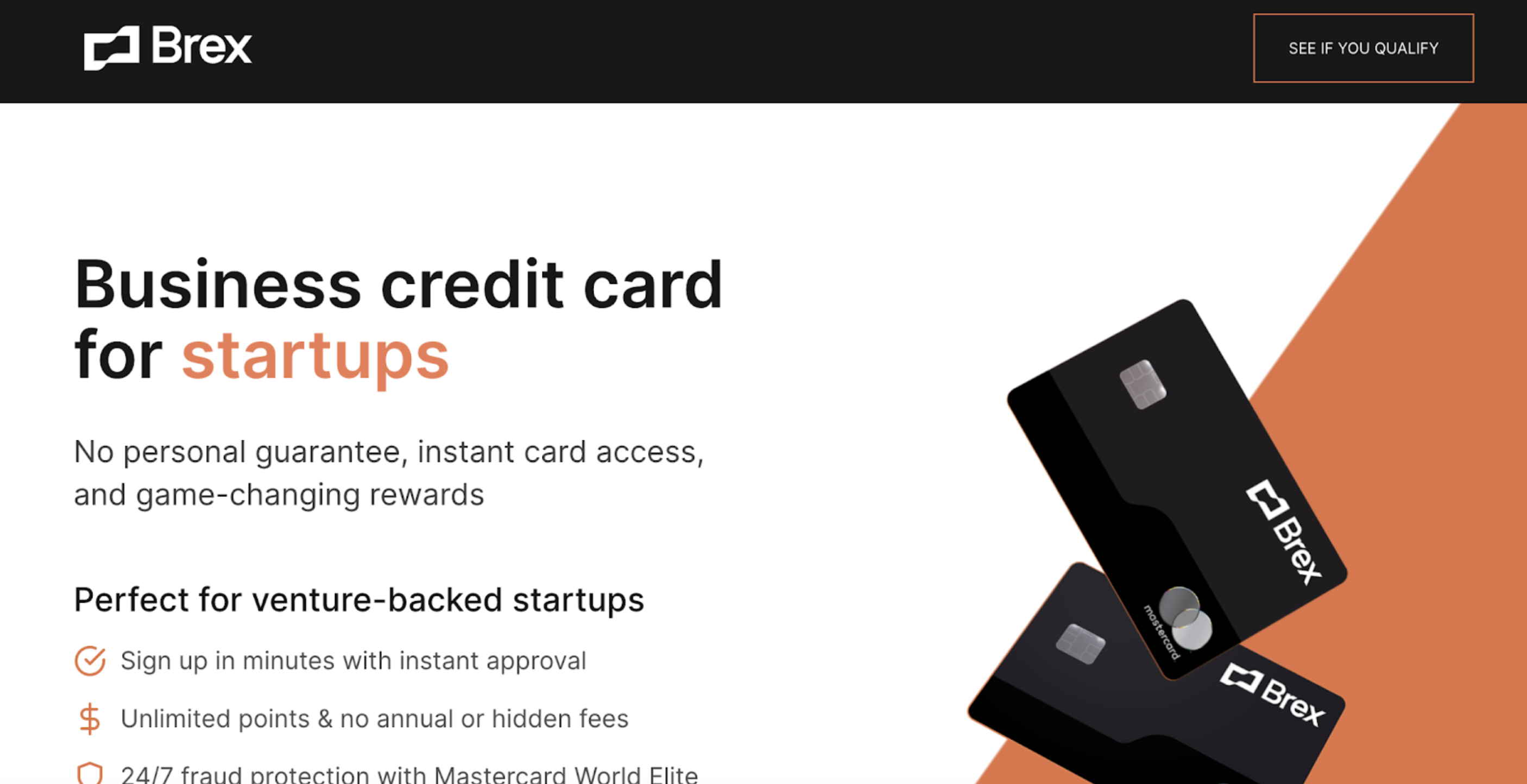
The wins you’ll get from sending potential customers to a landing page that speaks precisely to their needs are just the beginning though. They lay the foundation for future successes because you’ll determine what information people need to convert — and learn what persuades them to buy.
Show off the impact you’re making
There’s a saying in marketing, “If you can’t measure it, you can’t improve it.” So if you’ve set out to improve website engagement and conversions, hold-out testing is the best way to know whether the change you’ve made is moving the needle. We recommend using control groups to show the incremental effect of different experiences and measure their statistical significance.
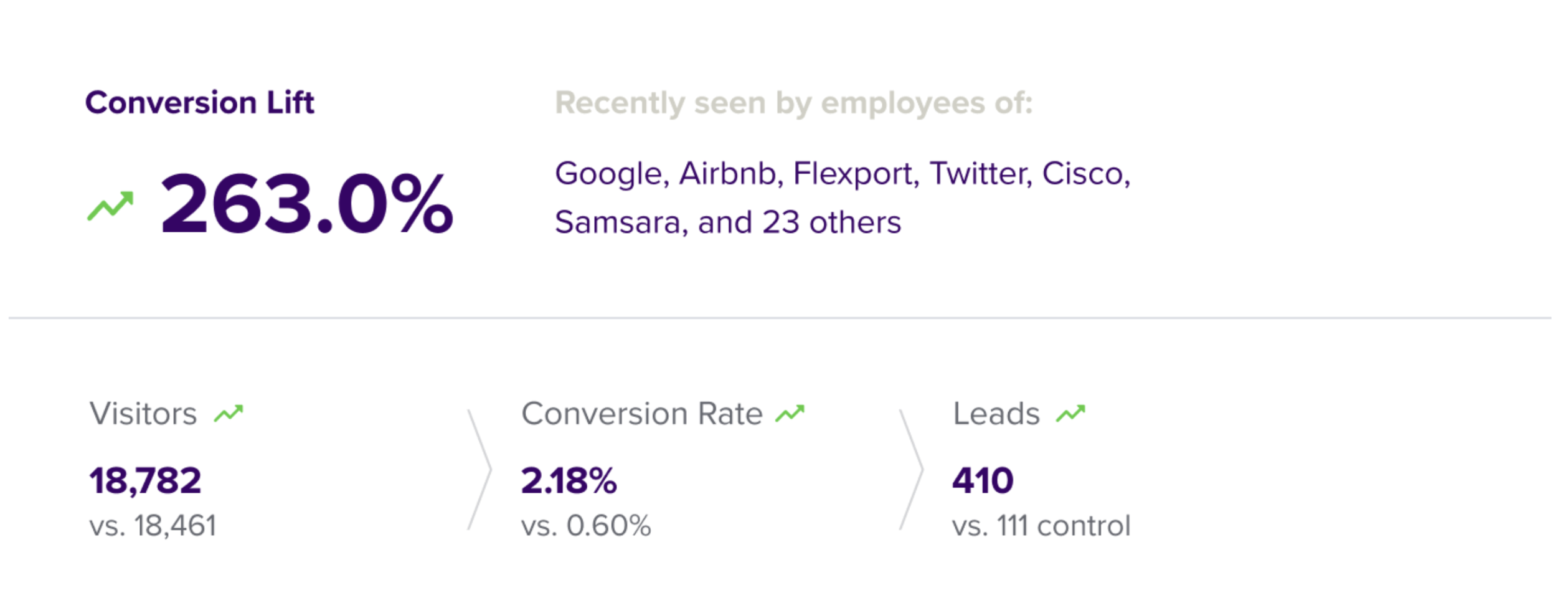
The more you test, the faster you’ll be able to iterate and find the winning combination of experiences that maximize top of funnel engagement and conversions.
