
by Crystal Widjaja for Reforge
From 20K orders per day to 5M. Zero to 100 people in business intelligence. Eight to 85 people in growth. All in 4.5 years. It was a wild ride, but not one that many in the US startup scene are familiar with. This wasn’t Uber or Lyft, but rather Gojek, Southeast Asia’s largest Super App.
For those unfamiliar with Gojek or Super Apps in general, the product serves all your on-demand needs. Ordering food, transportation, digital payments, hyper-local delivery, and a dozen other services. To give you a sense of scale, Gojek completes more daily food orders than Grubhub, Uber Eats, and DoorDash combined, and more trips than Lyft per day.
I was fortunate to have the opportunity to join Gojek when it was 30 people and within 4.5 years led the growth of the BI and Growth functions in the org to help it become the largest consumer transactional tech group in Southeast Asia. One of the keys to Gojek’s success was enabling the organization with robust and simple data systems to make data-informed decisions quickly.
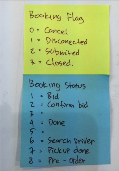
But it didn’t always start there. When I first joined, the “IT” guy was running SQL queries. Within the first week, I realized most of them were pretty inaccurate and most people didn’t understand what the data actually was. In fact, someone gave me a post-it note to tell me how to determine what a completed order was (flag_booking=2 and booking_status=4). There was no data infrastructure, all query results were copied/pasted into an excel report which was manually emailed to the executives.
I hired three data warehouse team members out of the gate. I implemented a strategy to put everything into a single Postgres data warehouse with Pentaho ETL. But that was rendered useless within eight months given our scale and growth. We then migrated to Google Cloud Platform and implemented BigQuery, BigTable, Data Flow, Airflow and more.
We also went through our fair share of visualization tools. We started with Tableau, then Metabase, then moved to internal tooling at about the three year mark. Our experimentation platform went from manual CSV uploads to BigQuery tables to internal systems closer to Airbnb’s ERF.
Needless to say, I cut my teeth on data at Gojek and have been helping startups like Carousell, Cashdrop, CRED, Celo, Sequoia portfolio companies and others navigate the maze since. Beyond all of the tooling, there is one foundational thing that makes or breaks any data initiative within a company: How you think about what to track, how to track it, and manage it over time. If you get these things wrong, the best tooling in the world won’t save you.
In this post, I break down:
- Data Symptoms: The most common symptoms that teams experience when it comes to data issues.
- Root Causes of Data Issues: The actual root causes of these symptoms.
- Step-by-Step Process: My step-by-step process to how I think about what to track, how to track it, and manage it over time complete with an Event Tracker template to help guide the process.
About the Author

Bad Data Habit Symptoms: “Our data is a mess!”
One team that I helped advise thought they had their onboarding flow tracked for over 6 months, but never got around to “using” and analyzing the data. The person who originally did it decided to leave the company. Once the team investigated, nothing added up. For example, the data was saying that more people did an action in onboarding than ever clicked “sign up” which was impossible. The data ended up being useless.
This story and my post-it note story are pretty common. Most companies would probably self-describe their data as a “mess.”
When they say this, they are typically referring to one of a few common symptoms:
- Lack of Shared Language
- Slow Transfer of Knowledge
- Lack of Trust
- Inability to Act On Data Quickly
Lack of Shared Language
There is an insane number of ways to describe the same experiences in an app. If you ask your team “how does a user get to checkout?” — in a lot of cases no one will say the same set of steps, using the same terminology.
This is mostly a problem when there are multiple ways to do the same thing in an app or when Navigation Tabs are unnamed icons. e.g. Pricing pages can be overview pricing or detail pricing. Is it Profile or Account Settings? These might sound like the same thing but are different in many products.
The lack of shared language starts to render the data useless. It takes a lot more time to have a thoughtful discussion with other teams about the data or get to a common understanding of what the data actually means. Even worse, teams might think they have a shared understanding when they really don’t. This friction commonly leads to frustration and avoiding using data at all.
Slow Transfer of Knowledge
New people join the team, current people switch teams, or people leave the company. Each time one of these things happens, a transfer of knowledge needs to take place before the person is “fully productive.” In an environment where it is common for someone to switch jobs every 18 months and switch teams even more often, this transfer of knowledge becomes key.
Many teams compensate for poor data products with lots of onboarding and training. But this ends up only being a band aid. It’s the same thing as trying to compensate for a really bad product with tons of onboarding, explaining, and customer training. It becomes expensive and ineffective over time.
This is even more true for internal employees and training. Team members want to spend their time doing the job, not consuming endless training.
Lack of Trust
How many times when you look at or present data do you ask yourself, “is that really right?” A common symptom of most data is that people in the organization just don’t trust it. Sometimes this stems from having bad data, but it can also just stem from people misinterpreting what a certain event or property means.
Not Being Able to Act on Data Quickly
All of these ladder up to one macro symptom: not being able to act on data quickly. In a world of quarterly OKRs and fast-moving competitive markets, teams will always be constrained by time and resources. When faced with a tradeoff of taking a lot of time just to get data they trust and can understand, and skipping that step just to move forward, a lot of teams will choose the latter.
The Root Causes of Data Issues
The challenge with the above is they are just symptoms. Many teams try to address the symptoms with things like:
- New Tooling
- Better/More Training
- Requiring a higher technical/analytical bar for hiring
But commonly these things can be waste of time and money because you aren’t addressing the root cause and real problems. Instead, the root cause typically stems from one or more of the following:
- Tracking metrics as the goal vs. analyzing them.
- Developer/Data mindset vs. a Business User mindset.
- Wrong level of abstraction.
- Written only vs. visual communication
- Data as a project vs. ongoing Initiative
Understanding them is important to separate successful from unsuccessful teams so let’s go through each one individually.
Tracking Metrics As The Goal vs. Analyzing Them
Many teams view the goal of data initiatives is to track metrics. The real goal though is to analyze those metrics. Those two things are very different. The latter is how we make information actionable. Making information actionable isn’t about reporting on the number of people that do something, it is about how we separate what successful people do vs. what failed people do in our products so that we can take steps towards improvements. This nuance is commonly lost, but as you will see fundamentally changes how we approach what we track and how we track it.
Developer/Data Mindset vs. Business User Mindset
A core principle of building any good product is deeply understanding and empathizing with your target user/customer. When building data systems, many teams lose sight of who their customer is, or don’t have one in mind at all — the business user.
Building great analytics systems starts by deeply understanding the problems, questions, and abilities of the business user just like you would for the target customer of a product. At Gojek one of the keys is that most of our business users were not SQL analysts. Instead, they were non-technical product managers, marketers, or operations managers.
We specifically built for them as our end customers with the goal of humanizing data and analytical processes. This influenced how we thought about everything from which tools to use, which events we track, how we name the events, to what properties were needed.
In the same way that we deeply think about how we name user-facing features or navigation in our products for clarity and usability, we need to think through details of how we name events, properties, and more within our analytics products.
The true test for us: Can someone in our operations/customer care team access the event tracking tool & UI platform and use it independently without a full onboarding session? The operations/care team was the least educated on the market, and most distant from the product development process. If they were able to analyze questions, then it was likely the rest of the team could as well.
Wrong Level of Abstraction
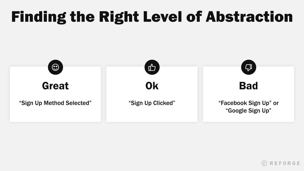
One of the toughest things to get right with tracking is the right level of abstraction on what to track. Bad tracking is when our events are too broad, good tracking is when our events are too specific, great tracking is when we have balanced the two.
Let’s take a look at an example:
Let’s think about a common event, signing up.
- (Bad) “Facebook Sign Up” or “Google Sign Up”: In this scenario, we’ve named the events “Facebook Sign Up” and “Google Sign Up”, depending on the “source”. However, it’s way too broad. Does that mean a sign-up method has been selected? The signup completed successfully? What if the sign-up was tried but failed? I don’t know the answers to any of those questions by just looking at the name of the event. In addition, if I wanted to know how many of these sign-ups occurred, I’d need to add across all of these unique events individually, making any potential analyses tedious and prohibitive for any PM.
- (Ok) “Sign Up Clicked”: In this scenario, we have been extremely specific with the event. Here, I at least know exactly what it means when the event has happened. The challenge will be if I wanted to look at all the sources of signup that were selected. I wouldn’t know what sources existed, and it’d be difficult to make actual decisions. While we have the “symptoms” of behavior through events, we do not have the ability to “diagnose” through parameter values.
- (Great) “Sign Up Method Selected”: In this example, we have the right level of abstraction. The event is clear, a signup method has been selected, and I have a property on the event of source so that I can segment by which method if needed.
To make this situation even more complicated, I often find teams have mixed different levels of abstraction together. Or, as user journeys and redesigns inevitably lead to new product flows, abstractions begin to clash over time with different ‘eras’ of implementations. This makes the system even more confusing and hard to understand.
We’ll talk more in the step-by-step process of how to get to the right level of abstraction.
Written Only vs Visual Communication
Having a shared source of “truth” about what an analytics event is and means is critical. Bad data teams won’t have any type of event dictionary or written documentation on what is being tracked, leaving it up to teams to all have their own definitions and interpretations. Good teams will at least have a shared dictionary that is updated with consistency. But great teams combine visual communication with the written.
No matter how well we name or define events and properties, nothing is more clear than a visual that corresponds with an event. When you are discussing an event, user journey, or other data people are visualizing in their heads the screens and parts of the product that correspond. Shortcut this process by making it clear and obvious.
As I’ll show later, I think about this in two ways. One, including screenshots of what is happening in the product when an event triggers. Two, mapping events to visual representations of customer journeys.
Data as a Project vs. a Core Initiative
Last but not least, is viewing data as a project vs an ongoing core initiative. You have to treat your data systems as product that you constantly iterate on. Over time your product will change, your goals will change, and the business changes.
As a result, if you aren’t constantly iterating it results in what Brian Balfour refers to as the Data Wheel of Death:
How To Fix The Root Causes Of Most Event Analytics Mistakes
The Tool: Event Tracking Dictionary
Before we dive into individual steps of the process, one key is to have a “tool” to help organize, align, and communicate decisions. For this, I use an Event Tracking Dictionary which defines the data that we are tracking and the important aspects of it. The process of doing this spec together creates the shared context and language across teams and different parts of the product.
We’ve provided a template along with an example which you can get here:
The baseline fields in the dictionary are:
- Event Name: What the action is called. Best named using specific phrases that a sophisticated user might use to describe their actions.
- Triggers when…: A specific API response, user action, or event that acts as the snapshot for this event and its properties being sent to our logs.
- Screen: A screenshot or image that illustrates where the user is when the action is triggered.
- Properties: A list of property names that will be tracked along with this event (e.g. source, isLoggedIn).
- Example Property Values: Best when done exhaustively, the list of potential values that fall under each property above. In cases where there is a limited set of potential values (e.g. potential sign-up sources like Facebook, Email, Google), it’s best to list them here.
- Data / Property Type: Each property should be constrained to one data type such as a boolean, string, numerical, latitude & longitude, or float.
- Description: How would you describe this event being captured to someone who has never used the product before? Use this field to remove any possibilities of misalignment between business teams using this in the future and engineering teams implementing these specifications.
- Technical Comments: OAuth, APIs, and internal services can have their own quirks that you want to detail out here. Specifications like aggregating 2XX responses into a single “Success” value can go here.
- Testing Comments – This is a living, breathing document. When new features are released, it’s good to pass through QA and ensure that events are firing as necessary. Communicating changes and issues here makes it quick to resolve issues.
You might have a different set of fields vs. the template. So what makes a good event tracking dictionary? There are a few keys I look for that make it a good asset to align the team:
1. Simple
At a minimum, the dictionary needs to be simple and easy to understand. Things like clear naming conventions are the basics. But the true test is if someone entering the company for the first time is able to look at the Event Tracker and quickly map the events to their actions in the product without needing to read every event’s definition.
2. Actionable
A business user of the event tracker need to be able to move from the sheet to the data to decisions without tons of involvement from a data analyst. A lot of times this comes down to the right level of comprehensiveness. Too few events tracked, and you will have incomplete information to make the decision. Too many events tracked, and it will be overwhelming.
3. Visual
Every event tracked should have screenshots. While people can interpret the names and descriptions of events in a lot of different ways, the visual representation of the screen ends up being much more specific and clear.
Step 1: Mindset of The Business User
As I mentioned earlier, the end user of most analytics systems are business users. We need to build something that empathizes with that end user. This means humanizing data and analytical processes. This influences how we choose the tools to use, the events to track, how to name the events, and what properties are needed. It is worth spending a meaningful amount of time here, just as we would in customer research for a new product.
To get into the mindset of the business user, there are four levels of questions I go through. For each question, I have provided some examples from a product I recently worked with named Honeydu which is a way for companies to send and receive invoices online for free.
- What are the business goals and objectives?What are the key results and metrics that the business and executive team is optimizing for? Sources of this information would be current and historical OKRs, quarterly and yearly planning documents, and board decks.Example One: X new users receiving/sending an invoice by end of Q4 2020Example Two: X% of invoices sent to new users lead to a new user sign upExample Three: X recurring invoices active by end of Q4 2020
- What are the objectives and goals of each team?The high-level goals of the company aren’t enough. Each team will typically have a set of objectives and goals that ladder up to the company-level metrics. To understand these objectives and goals you can seek out each team’s OKR’s, talk to the team leaders, etc. Here you want to both understand what they were for a few time periods historically and what the team leaders are thinking they might be for a few time periods in the future.Example One: (New User Growth) 2 invoices sent within the first 7 daysExample Two: (Payment Integrations) 85% of new payment methods added are successfully verifiedExample Three: (NUX) % of New Users starting with an invoice template
- What are the product experiences around these goals and objectives?Next, for each of the goals/objectives, I identify the product experiences that correspond with driving those goals/objectives. It is important to not just identify what the specific screen of the product or the funnel, but the context of the experience that might influence the goal or action. For example, in a ride-sharing product like Uber, if the product experience was booking a ride, in addition to the funnel of booking a ride I might want to understand how many drivers were on the map? Or, what the estimated time was?Step 1: In Honeydu, lots of different factors could lead to a user sending their first invoice, our core action. We’d ask ourselves:
- When a user is selecting a contact to send an invoice to, are they more likely to be successful when a contact is available on the user’s list of historical Businesses or when they need to search?
- What are the supporting actions that help users create and send their first invoice? Are invoice templates a good way of accelerating the time-to-send? Or is it more important that their contacts are imported first?
- What are the questions/hypotheses I/they might want to answer around these goals and product experiences?Next, I think about what questions or hypotheses they (or I) might have around those goals or objectives. Similarly here, talk to team leads or individual contributors on the team about what questions they faced. But also think through yourself, come up with hypotheses of questions, and validate the importance level of those questions with that team.Example One: One of the key goals and product experiences on Honeydu is when someone sends their first invoice. I’d ask the question, what experiences do I think need to happen in order for someone to feel confident about sending their invoice to a business? Hypotheses like “they need out with one of our industry-approved templates” or “they see the business already listed in the Honeydu network” indicate experiences that we need to be able to track in order to quantify and move on from hypotheses to confidence in correlation/causation.Example Two: The more users that pay an invoice through Honeydu, the more revenue we generate. We should track at what point users are most likely to pay an invoice, asking ourselves: “When are users most likely to pay an invoice through Honeydu? When it’s due today? Tomorrow?” By tracking the daysTillDueDate property on the Pay Invoice Successful event, we can inform and build our push notification and email strategy for users who don’t organically reach the experience of seeing an invoice’s due date without spamming them outside of their natural inclinations.
Step 2: Journeys Instead of Metrics
One of the keys I discussed earlier was getting to the right level of abstraction in events. The foundation of this is tracking journeys, not metrics.
While we use the goals and objectives from step one as an input into what we track, stopping there ends up in bad event tracking. Bad event tracking often looks like the individual asked themselves: “Can I calculate all my OKRs with these metrics?” (e.g. # users clicking sign up, # completing order, conversion between Sign Up and Completed). The problem with this is that it’s going to lead to dead ends. You will be able to know “50% of my users signed up” but won’t be able to ask “why?”
To answer the question of “why?” you first need to understand the journey of intent, success, and failure and then the context for each of those events in the journey (which we’ll track with properties in step 3).
A couple of quick examples showing the event journey of Intent → Success → Failure:
- Example One
- Intent: Add New Payment Method Selected & Add New Payment Details Submitted
- Success: Add New Payment Method Successful
- Failure: Add New Payment Method Failed
- Example Two
- Intent: Create Invoice Selected → New Invoice Started → Contact Search
- Success: Recipient Added to Invoice → Invoice Sent
- Failure: Invoice Draft Saved (a default action)
Success Events
I first think through the success events. A success event is when an action in the product has been completed successfully. These events stem from the business goals that I collect in step one. Examples of success events might include:
- Payment Successful
- Signup Successful
- Invoice Sent
- Booking Completed
In order to not go overboard and track everything, I pressure test each event with a question. “Imagine I did track this, and 99% of users did it, what would I do about it? What does it tell me?” If I’m unable to to find something actionable on the extreme, then the event is likely unhelpful.
Intent Events
For each success event, I then think through the intent events. An intent event is often a step required as the precursor to any success event. Tracking intent events are critical to understanding the “why” around the success events.
Intent events inform me of how “educated” and “motivated” the user is to complete some step for the action I want them to complete. Everything is actually an intent event of some next event — but we often only think of them as “goals” which prevents us from tracking them accurately. For example, in a ride sharing app Selecting a Destination is a goal, but requires an intent/setup event of selecting a ride type (in the old Lyft/Uber flow). Then, booking the actual ride becomes the goal, but requires the intent/setup event of finding a destination from search/history… and so on
In order to come up with the intent events I ask: What are the steps I have to complete in order to complete the success event? Common examples include:
- In our first journey example, we noted the intent events of “Add New Payment Method Selected” and “Add New Payment Details Submitted”
- Note that we have two levels of intent here: high intent, where a user is actively submitting their payment details; and low, but indicative intent, where a user is selecting whether to add their payment details by bank or credit card. Drop-offs in between these events lead to actionable next steps for a team: either the user found the input fields daunting, or didn’t have this information available at the time. We now know if they had selected a bank or credit card payment method, and can follow up with more information and personalized content that helps the user get through this step.
I also use intent events to identify the paths that a user naturally takes while completing an action. For example, with our invoicing and bill payment app, do users start sending invoices by importing the contact first, or creating the invoice first? How does this behavior change as our bill payment network grows?
Similarly, in Gojek’s food delivery product, in the early days, we noticed our most successful users were those who already knew what they wanted to eat and were coming to Gojek simply to fulfill the delivery service. The intent event of these users would be searching for a specific restaurant, finding the menu items they wanted, and finally, setting their delivery details. However, as these users matured, we noticed the most prevalent user intent journeys shift as users began using Gojek more as a means of new restaurant discovery rather than fulfillment of restaurants they already knew. Now, intent events would be things like scrolling through their friends’ food feeds, browsing discounted deals, or using the Nearby feature.
These intent events are crucial for understanding what Bangaly Kaba (Reforge EIR, Former Head of Growth at Instagram) calls our adjacent users. As users mature and markets expand, these journeys evolve over time and our product should, too, by matching the intent of both new and mature users.
Failure Events
A failure event is something that happens between an intent event and success event that prevents the user from achieving success. In-between intent events and success events live a number of failure paths that users could encounter. Understanding the failure paths is just as critical to understanding the success paths as they give us actionable information on how to improve the success event. To come up with failure events I ask: What are the possible things that prevent the user from completing the goal?
There are two types of failure events:
- Implicit Failures are the drop-offs that occur before the successful completion of the goal. The user just “disappears” from our journey. In example two of our journeys above, events are tracked in a way that provides two implicit failure indicators:
- Users that perform Create Invoice Selected but do not perform New Invoice Started within 5 minutes indicate a failure in our activation journey.
- Users that perform Contact Search but do not perform Recipient Added to Invoice within 5 minutes indicate a failure in our search results or search history. Users may not feel motivated enough to create a contact from scratch or found confusing results.
- Explicit Failures are events where the intended experience goes wrong.
- Events like “Ride Cancelled” on Lyft or “Order Cancelled – Restaurant Closed” when ordering food delivery are examples of explicit failures
- In Honeydu, Add New Payment Method Failed and Pay Invoice Failed are two examples of events that often get forgotten in the event tracking exercise because they are responses to a user’s behavior, rather than actual actions taken within the product. However, if your web/mobile app receives errors and displays them to your user, these should be easy to track and log for monitoring. Storing these error response messages as an event property is an easy way to quickly diagnose why a common user journey may suddenly be failing.
Step 3: Properties
Once we have our success, intent, and failure events the next step is to figure out the properties that we want to associate with the event. Properties are once again a key to achieving two of our main goals, providing the right level of abstraction and making the data actionable.
Properties are essentially things ways that I might want to segment the events. A key mistake is tracking a segmentation as an event itself. For example:
- Good: Signup Up Selected (event), Source (property), Facebook (property value)
- Bad: Facebook Signup Selected
A key source to understand which properties you might need to track are the questions and hypotheses you uncovered in step one.
- Question Example: How do users prefer to add their contacts?
- Property Example: source → History / Import / Manual Entry
- Hypothesis Example: Users that are new to freelancing are more likely to use templates to get started, and will require more onboarding to get to core value than users that choose to Build Their Own invoice.
- Property Example: templateName → (null)/Basic Invoice/etc.
Some high-level questions I like to ask to determine which properties are important:
- How will I be able to segment users who became frustrated versus disinterested?
- How will I be able to identify the different paths that mature versus casual users use?
- Does this give me enough nuanced data to compare and contrast successful users from dropped off users?
- If this were the last event that I ever tracked from a user, what would I want to know about the user’s experience on this screen?
Properties tend to fall into one of a few common buckets. To make sure I’m being thorough, I use these buckets to see if I’m missing anything:
User Profile Properties
The most common set of properties are those related to the profile of the user. This could be demographic or firmographic information. Some examples:
- City
- Age
- Company size
- Role
- Product Tier
Often times these are things that you want to be able to permanently segment both users and events onwards until the property is changed. Some platforms like Mixpanel contain a feature like super-properties that allows you to do this easily. Questions to ask to figure out which of these properties to track:
- If I were to be a personal assistant for this user, what are the preferences I’d need to know about them in order to be helpful?
- What demographic information might influence the behavior of a user?
Marketing Properties
The second most common set of properties are those related to marketing that might impact or influence the user’s behavior. This could include things like:
- Source
- Campaign
- Entry Page
User Action Properties
Another set of properties is those related to the actions of the user. For example:
- First Purchase Date
- First Service Type
- Total Orders
Here it is important to distinguish between two types of properties:
- Set and Forget: These are properties you set once, but don’t change after. Examples would be things like First Purchase Date, First Sign Up Attribution, and Birthdate.
- Append/Increment: These are properties you use to segment and create relevant, personalized user experiences. Incremented attributes could be things like Total Purchases, Total Revenue, and so on. Appending (and removing) user attributes allows teams to quickly identify relevant users for promotions, new updates, and experiences they’ve already indicated interest for. Examples could be things like a list of restaurants you’ve already purchased from (food delivery), a list of stores you’ve favorited (hyperlocal POIs), or features the user has used.
Type of Action Properties
Most events have a type associate with them. Distinguishing between the type is important to getting actionable data. Some examples:
- Ride Cancelled: User Initiated vs. System Initiated
- Payment Selected: Credit Card vs. Wire Transfer
- Photo Uploaded: Camera vs. Gallery
- Login Successful: Google vs. Facebook vs. Email vs. Phone
To figure out the types I ask questions like:
- Who is responsible for this conversion (or failure)?
- What is responsible for this conversion (or failure)?
- What are the preferences this user has in completing this action?
- How would I describe the most important user journey path for this action?
- What additional information could I use to predict future actions of this user based on this action?
Contextual Properties
Contextual properties are those that help me understand what might be influencing the motivation of the user to complete or not complete the goal. Some examples:
- The number of drivers on the screen
- The types of merchants displayed
- The number of search results
Questions that I find helpful to uncover contextual properties might include:
- What could influence motivation of the user to complete the goal?
- How could I differentiate an increase or decrease in motivation?
- Imagine this was the last event that we ever track from the user. What would we want to know about the experience?
Step 4: Pressure Test
Once you have your set of events and properties defined, you should pressure test understanding and actionability.
Testing for Understanding
An event or property might make sense to us, but the question is does it make sense to your end audience? If people don’t understand the basics like what an event is, then doing actual analysis isn’t going to happen. The key here is that you should get business users, not developers, to sign off.
At Gojek, the first time things were instrumented by our mobile developers. They created event names for our mobile application like “Signup Handler” or “Cached Result Feed.” Those events made sense to them, but were a foreign language to the business users. Because of the obscurity, no one used any of the analytics tools we had implemented.
There are a few audiences I recommend testing for understanding:
- Business users close to product developmentThe first group you should test with are business users close to product development. This is typically product managers. Those that are closer to product development tend to have more knowledge of how the product works. So if things are confusing to them, it will be confusing to those with less knowledge.
- Business users farther away from product developmentThe next group are business users that are farther away from product development. This is typically marketers or those in customer support. They typically have less detailed knowledge of how the product works, but should be able understand all of the events and properties.
- New EmployeesThe next group are new employees. New employees haven’t gotten accustom to the companies lingo or acronyms yet. Ultimately you are looking for these new employees to be able to understand the events and data with out tons of hands on training.At Gojek I implemented a “quick quiz” for users to get access to our analytics tools. I knew our event tracking was starting to become a mess when users wouldn’t be able to “pass” the quiz. So I recommend people to flip “onboarding and testing” of new employees on its head and use it to test how good your “internal event instrumentation product” is instead.
In any of these cases, if you find something that is confusing to the end user, a simple question to ask to uncover new naming would be: “What would you call when a customer [does action] on this [part of the product]?”
Testing for Actionability
Understanding the data is the first step, but we need to pressure test whether or not the data is actionable. Here, we should go back to list of questions and hypotheses that we generated in step one, choose a sample of them, and pressure test how we might answer those questions and hypotheses.
At Gojek a common question that came up across the product, operations, finance, and research teams was “What makes the [best/happiest/most productive] driver?” The key here is that what “happy” is for finance might be different from what “happy” is for the Driver Benefits team. Or what “most productive” is different from Transport Team than it is from the Food Delivery team.
So we needed to test for actionability across these teams and use cases by coming up with hypotheses of how we might analyze the question from the various perspectives. Could we segment drivers into human-understood groups like 5 Star Drivers, Long Distance Drivers, Service Type, and more.
Step 5: Track “Decisions Made Without Data”
No matter how thorough you are with the above process, there will always be changes you need to make. The business, goals, and product are constantly changing creating new needs. You can never anticipate 100% of the questions and hypotheses that need to be answered.
One exercise that I recommend the data team run regularly is what I call “Decisions Made Without Data.” It’s pretty simple. Every quarter we kept a list of decisions that the broader team made without data.
For example, while at Gojek a question emerged whether or not paying drivers more quickly drove driver retention. At the time we weren’t tracking the proper data to inform this question. Someone had come up with a threshold based on their own intuition and rationale. Uncovering that decision made without data led us to start tracking some new things in the data so that we could confirm speed of payment did drive retention and develop specific product and marketing initiatives around it.
The exercise helps you uncover things that you either overlooked, didn’t anticipate, or changed in the business. To be clear, I’m not saying that everything must be decided only when data is available. The reality of any fast-growing company is that some decisions will need to be made without data. But the list helps uncover situations where we lacked data that could have been helpful in a key decision.
Ongoing Signals of Success
Creating an excellent system of data in an organization is always an ongoing effort of iteration. When you are working on internal tooling and systems where your customer is another set of employees vs the end customer for the company, you don’t have the visceral feedback of revenue or other metrics to tell you whether you are doing a bad, good, or great job. Here are some signals you can use to understand how things are going:
Bad Signals
- There is a single person who knows how to do tracking; no one else knows how to write the event specs themselves.
- Data analysts are needed to do basic analysis around key goals and objectives. Event names and property names are duplicated, in multiple casings (e.g. Sign up and Sign Up).
- The number of decisions made with out data each quarter is growing.
- Usage of the analytics tools is low.
- When new features and products get added, event tracking isn’t updated to reflect the new paths.
- Funnel data is logically impossible (e.g. more users doing Step 2 than Step 1).
Good Signals:
- Lots of teams are using the event tracking sheet and analytics tool (track usage of your tools like you track usage of your product).
- Other teams are contributing and trying to track new parts of the product development.
- The event tracker gets updated as new features/ways of doing things in the app are implemented.
- It’s easier for a business team to pull the data from the analytics platform than to write transactional queries to find the answers to their questions.
Great Signals:
- Event tracking is embedded within your regular setting of team goals and objectives to make sure the team is armed with the proper information.
- Teams further and further away from the development process (i.e. customer support) are using the tooling on a regular basis without tons of detailed training.
- Even when the product has a major redesign, the event tracking is able to leverage the original event names and properties logic.
- Teams can put their money behind it: The event tracking can be trusted to segment users and allocate user incentives (e.g. referrals, discounts, promotions).